
User Experience on Mobile Devices improving
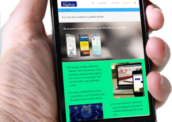
While designing a new project, we follow a methodology from our offer to agreement and execution. ‘Mobile friendly’ has come to main focus; adding required design element every website we design is normally mobile-friendly and includes the modern presentations, content/image sliders. The website is viewable on any mobile or tablet device and function well as designed. For good reasons, the mobile websites and functionality, mobile only applications are emerging fast.
Our focus; build responsive websites. The benefits are
-
Responsive design sites are fluid, the content can easily move across all kinds of screen resolutions on all the devices.
-
Responsive design provides the best user experience, whether the professionals use it from a desktop computer or from the mobile devices. You can consume the content of the site and also there is no need of any scrolling and resizing the website according to the device.
-
Responsive design enhances SEO efforts with which the visitors can use on device of their preference.
Responsive design is therefore a practice of building a website which is suitable to work on each and every device and on all resolutions. It is must for all the tablets and the mobile devices and they can thus expand themselves in all sizes. The computer as well as the mobile phone users is also benefitted from responsive design.
